
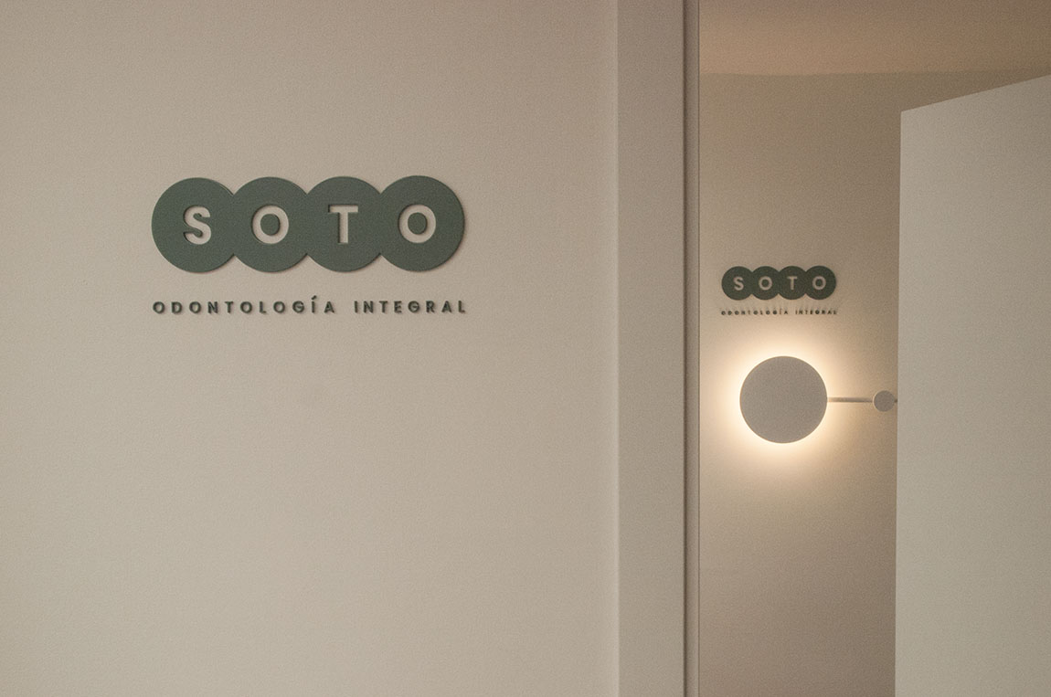
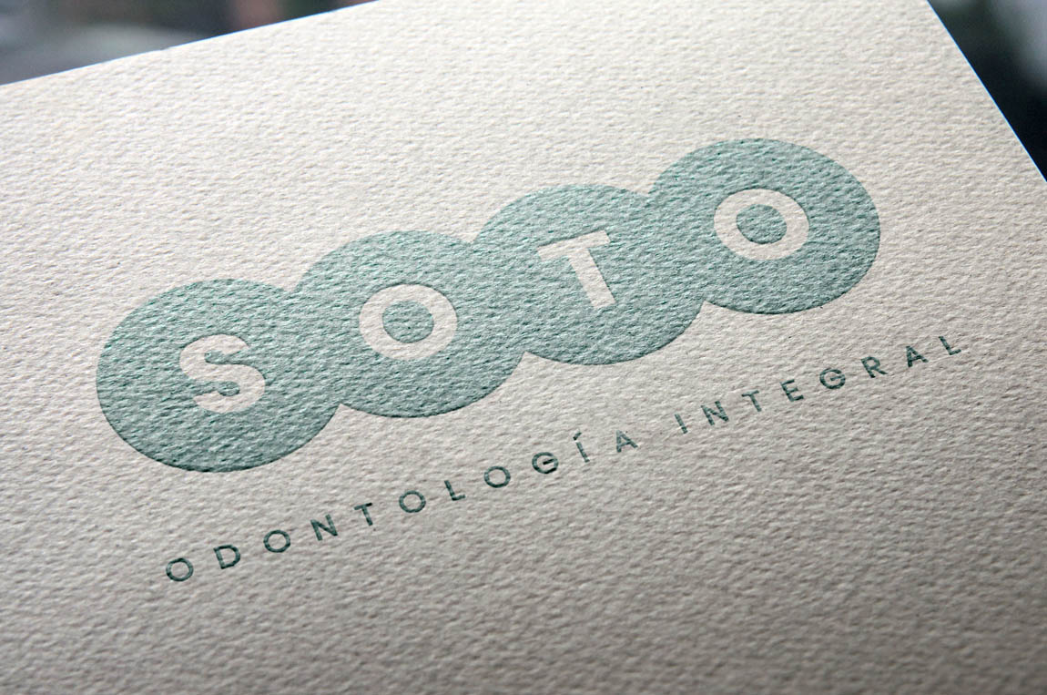
Soto Brand
A redesign of the brand is carried out, taking as inspiration the “odontogram” of the previous brand. The design of the logo of the dental clinic takes the surname “SOTO” which takes on greater prominence and provides solemnity and professionalism to the brand with a more explanatory, more clarifying slogan.
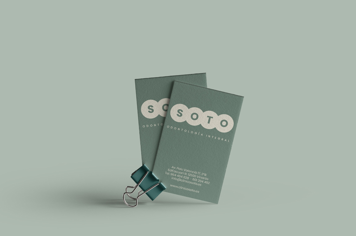
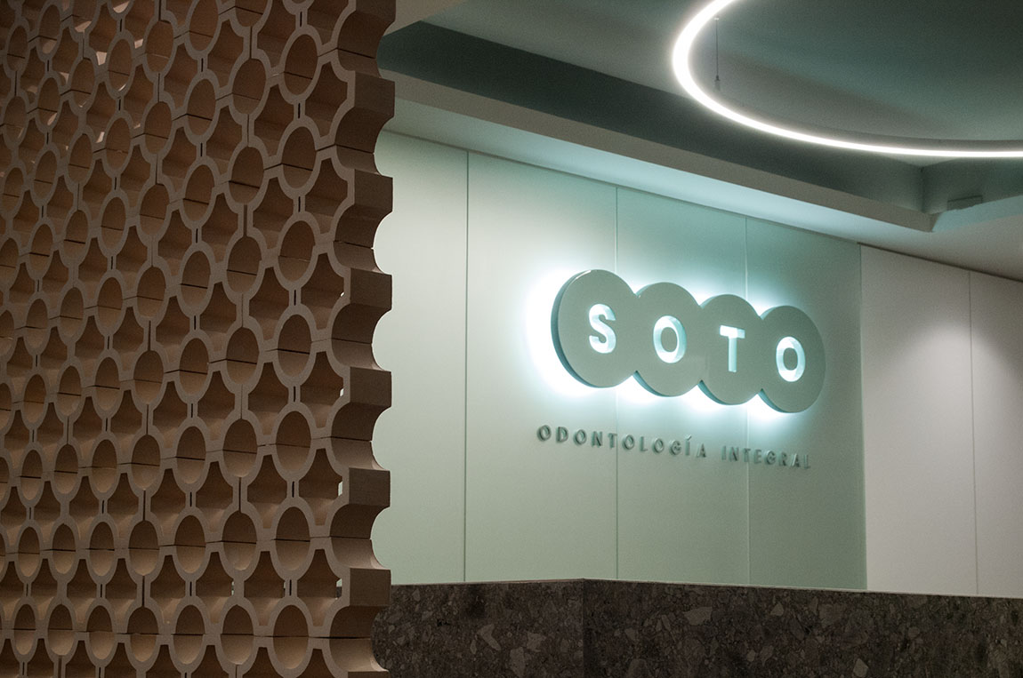

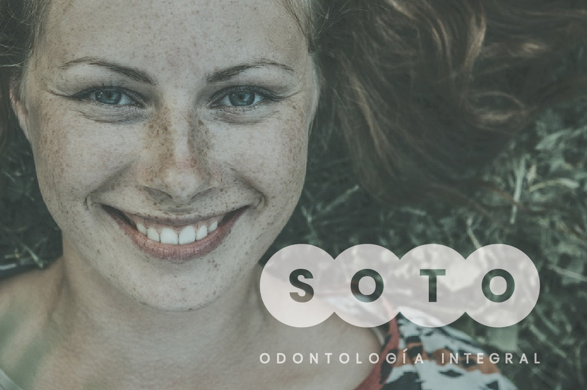


The circle, as a geometric figure that symbolizes the balance between body and soul, forms a chain, a transition, an evolution and also an odontogram in which the circles intersect, the complementarity between two elements, the holistic approach, the balance, the wellness, etc.
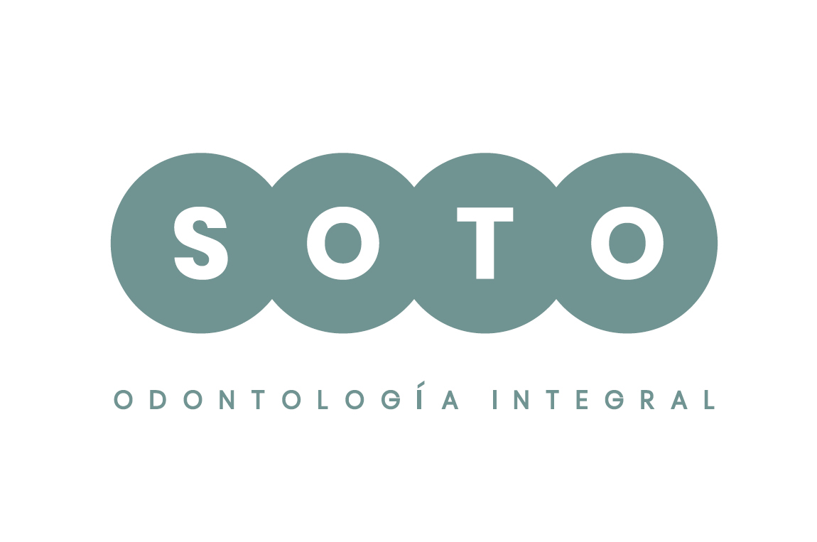


The result is a sinuous and very conceptual, honest and simple figure that has great communicative potential. All the brand applications that will be used in the marketing actions of the dental clinic are designed.

Corporate Communication Strategy | Branding

