Brand redesign: Rovira Más, dental clinic
Branding for dental clinic, Benifayó
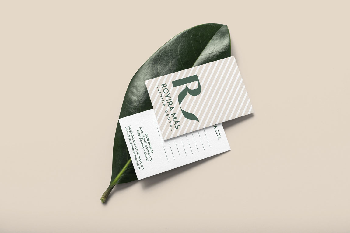
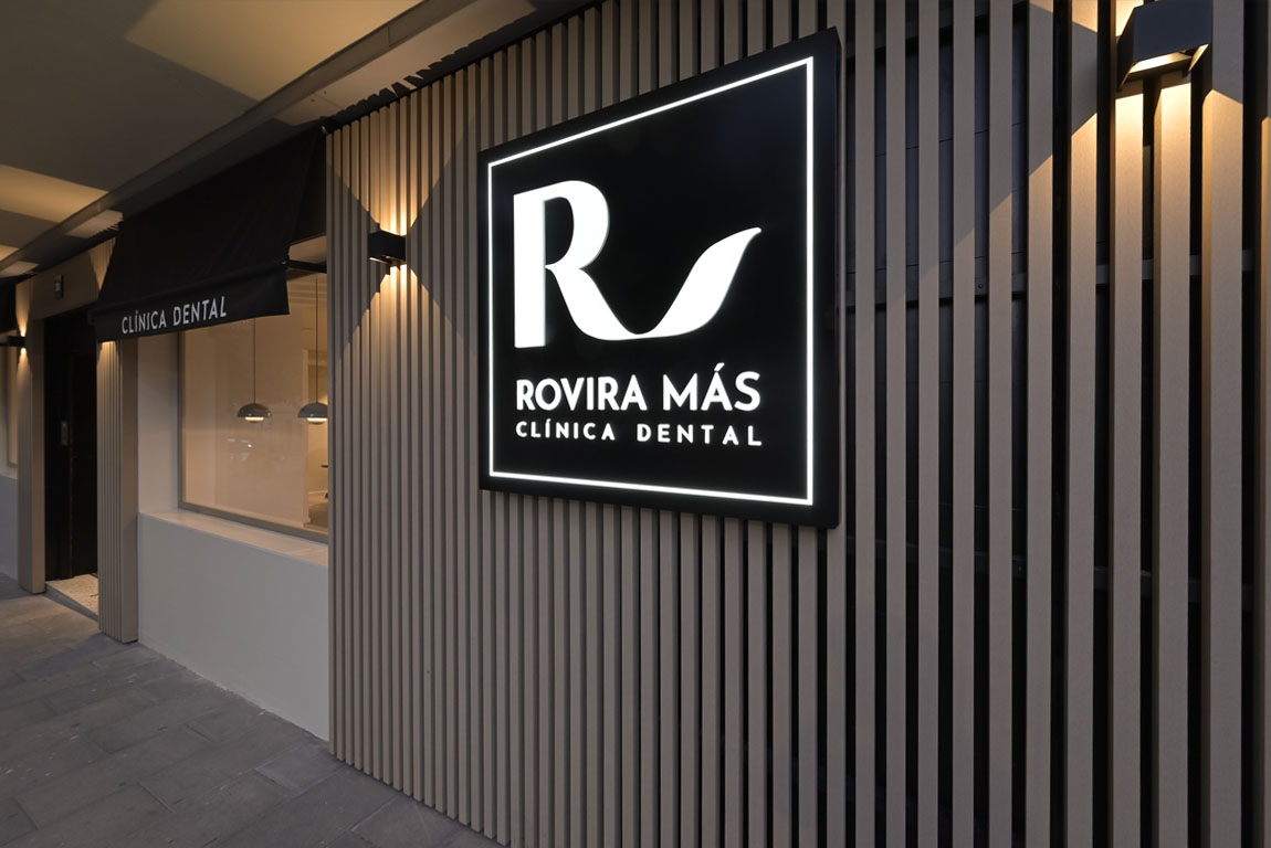
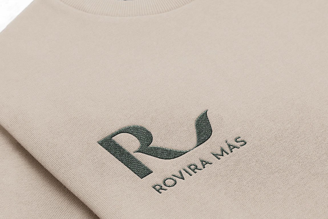
The redesign of the brand proposes an identity consistent with the clinic’s leadership positioning. Starting from the initial of the last name, a very recognizable monogram is designed, characteristic of a premium brand. The “R” is conceptualized as a personal signature, taking into account legibility and reproduction, as well as classic proportions. The result is a refined monogram that conveys exclusivity and leadership.
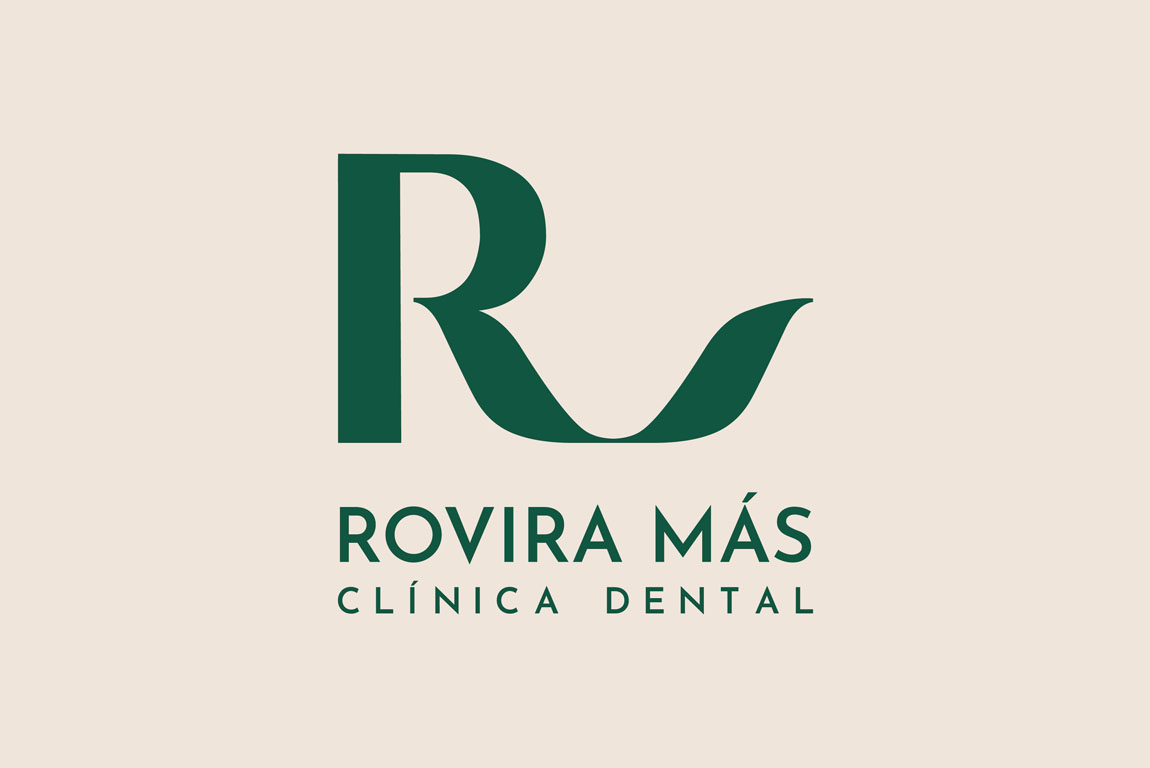
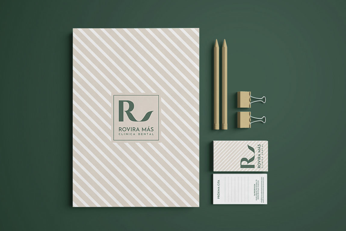
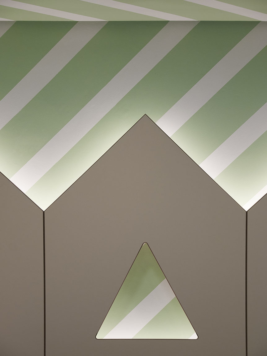
In addition to the monogram, the rest of the brand is developed with an elegant and geometric serif typography that summarizes the essence of the business. Inspired by premium brands, a striped pattern is designed for its ability to create symmetry and order, providing the elegance and sophistication needed to complete the overall brand universe.
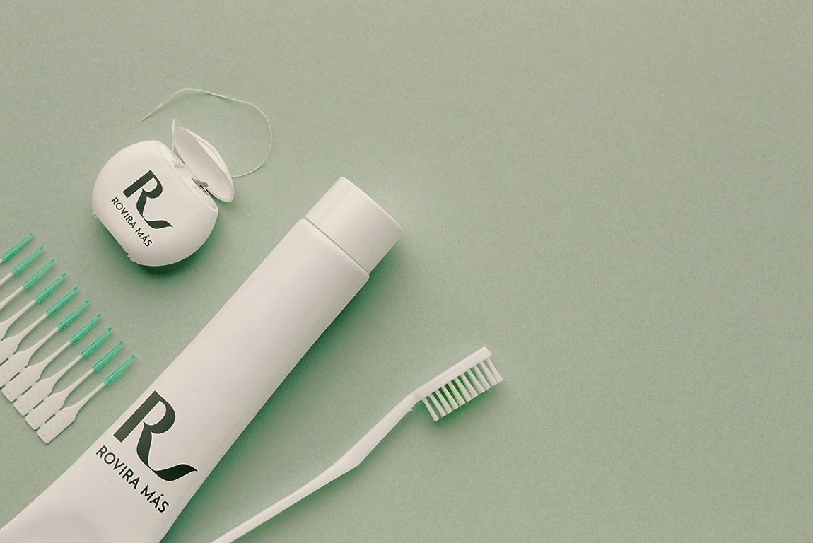

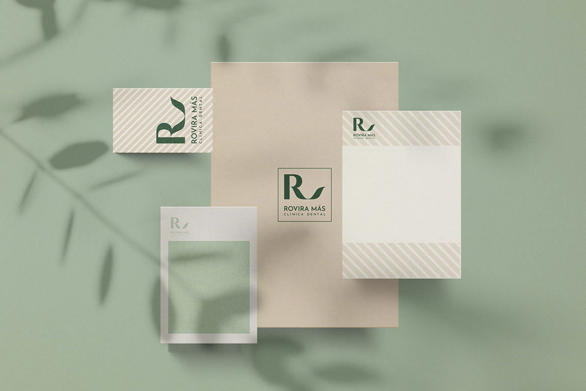

The color palette includes dark green, mint and cream. The objective is to convey elegance and well-being with a calming effect associated with harmony, softness and serenity. This results in a strong, honest and delicate brand with great communication potential. The rest of the brand’s applications are designed for use in clinical communication and marketing.